Subtle & Sophisticated
Color Styles & Techniques
Learn how to create a calm, refined home with color that feels intentional, layered, and quietly luxurious.
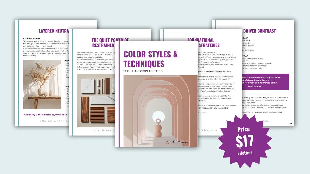
Create Calm, Refined Rooms That Feel
Layered, Not Bland
Subtle & Sophisticated Color Styles & Techniques
Learn how to use soft neutrals, muted color, value shifts, undertone alignment, and light-responsive palettes to create a
home that feels calm, cohesive, and quietly luxurious.
Refined spaces are not accidental.
Subtle & Sophisticated Color Styles & Techniques explores the design principles that make restrained color feel rich, architectural, and complete.
Instead of relying on obvious contrast or trend-based neutrals, this guide shows how refined rooms are built through hue-family alignment, value shifts, layered neutrals, softened monochromatic palettes, and thoughtful material relationships.
I would strongly recommend replacing
undertone alignment with hue-family alignment in some places, because that is more aligned with your current philosophy. You can still use “undertone” where the homeowner needs the familiar language, but “hue-family alignment” sounds more professional and more distinctive
to your brand.
Subtle & Sophisticated Color Styles
& Techniques
What You’ll Learn Inside
1. Soft Neutral Layering
How to create depth with related neutrals instead of relying on obvious contrast.
2. Hue-Family & Undertone Alignment
Why colors that look similar can still clash — and how to create cleaner relationships between paint, finishes, and furnishings.
3. Soft Contrast
How light and dark value relationships create structure without introducing unnecessary new hues.
4. Muted Monochromatic Design
How one color family can feel layered, calm, and dimensional instead of flat.
5. Warm Minimalism
How to make simple spaces feel modern, edited, and inviting.
6. Muted Earth Tones
How to use softened nature-inspired color without making a room feel heavy, muddy, or overly themed.
7. Light & Shadow Neutrals
How subtle tonal shifts and natural light create atmosphere, softness, and quiet dimension.
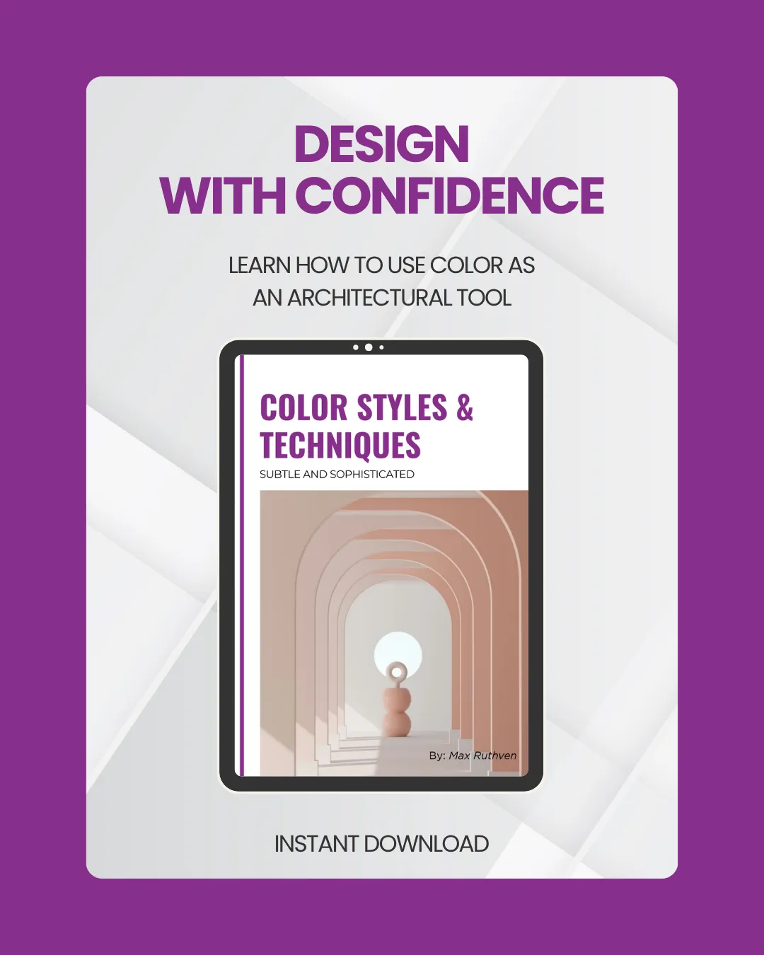
Ready to Make Subtle Color Feel Intentional?
Soft color should never feel unfinished, washed out, or accidental. With the right relationships between hue, value, light, and materials, a restrained palette can feel calm, dimensional, and deeply refined.
Download Subtle & Sophisticated Color Styles & Techniques and learn how to create softer spaces with more confidence and clarity.
One-time purchase | Instant digital access | Professional design framework
Why This Guide Is Different
Most color advice focuses on choosing a pretty paint color.
This guide goes deeper.
It helps you understand why some soft spaces feel elevated and cohesive, while others feel flat, dull, or almost right but never fully resolved.
You’ll learn how hue family, value, texture, light, and fixed materials work together — so your color decisions feel intentional before you commit to paint, finishes, or furnishings.
This is a design-focused color guide for people who want more than generic decorating advice.
Who This Guide Is For
This guide is for you if:
You love soft, elevated interiors but do not want them to feel boring.
You are drawn to neutrals, muted tones, natural materials, and quieter palettes.
You want your home to feel cohesive instead of pieced together.
You keep choosing colors that feel “almost right” but not fully resolved.
You want to understand how light, finishes, and paint colors influence each other.
You want a designer’s perspective on subtle color without the fluff.
You want to make better decisions before committing to paint, furnishings, or finishes.
What Makes Subtle Color So Powerful
Subtle color asks more of a space, not less.
When bold color is removed, every shift in hue, value, material, texture, and light becomes more visible. That is why refined rooms can feel effortless when they are done well — and unresolved when the relationships are slightly off.
This guide helps you see those relationships more clearly, so you can create rooms that feel soft, calm, and intentional from every angle.
What You’ll Walk Away With
After reading this guide, you will better understand how to:
Build a neutral palette with depth and dimension.
Avoid subtle clashes between paint colors, finishes, and furnishings.
Use contrast in a softer, more sophisticated way.
Make muted palettes feel layered instead of dull.
Work with natural and artificial light instead of fighting against it.
Choose colors that support the architecture of the room.
Create a home that feels calm, cohesive, and visually resolved.

©2026 Max Ruthven LLC Color and Design, All rights reserved.