Nature-Derived Architectural Palettes
Learn how to use nature-inspired color with clarity, restraint, and architectural intention.
Nature-Inspired Color Style
A professional framework for using biophilic design, organic hues, and natural textures
to create balanced, restorative sanctuaries.
Your home should be a retreat—not just a residence.
In an increasingly high-stress world, our interiors must do more than look good; they must help us recharge. Yet, many spaces feel clinical, disconnected, or visually cluttered because they lack a connection to the natural world.
What You’ll Master Inside
1. How to build a palette from the foundations of architectural color
You will understand how hue, value, chroma, and light reflectance affect the way a color behaves in space, and why undertone matching is essential to a balanced, cohesive result.
2. Why nature-inspired color works so powerfully in interiors
The guide explains that our response to natural hues is not only psychological but biological, and why greens, blues, mineral tones, and softened neutrals often feel calming, credible, and enduring.
3. How to use five distinct nature-inspired palette directions intentionally
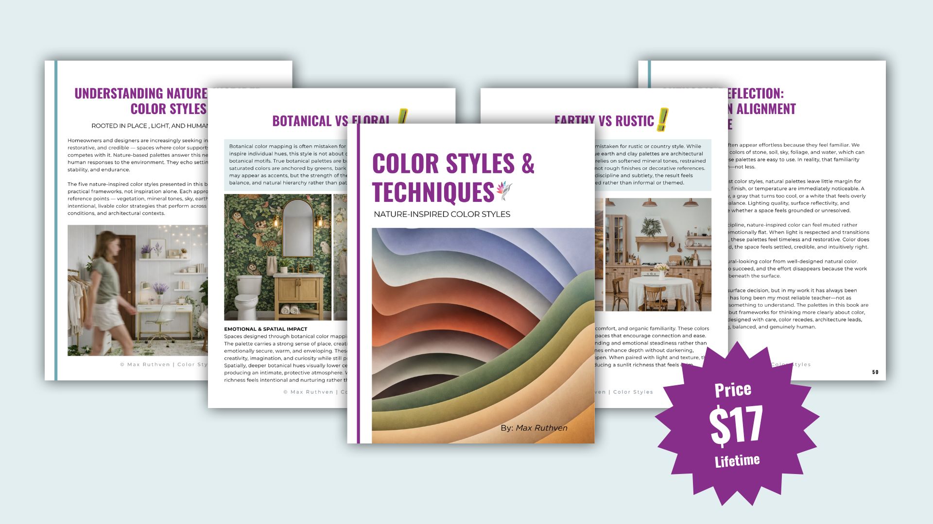
You will learn how different palette families function, what mood and spatial effect they create, where they perform best, and what design mistakes to avoid. The guide covers Biophilic, Coastal Drift / Oceanic, Botanical, Earth & Clay / Mineral, and Atmospheric Neutrals.
4. How to make subtle color feel refined instead of flat
A major theme throughout the book is that nature-inspired color is not effortless. Its success depends on precision: light quality, finish, material pairing, restraint, and carefully managed transitions.
The Five Palette Directions Covered
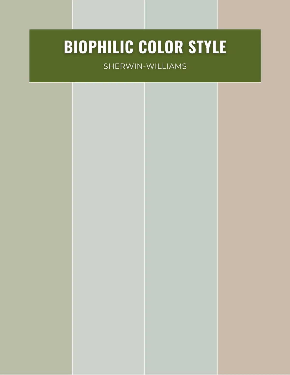
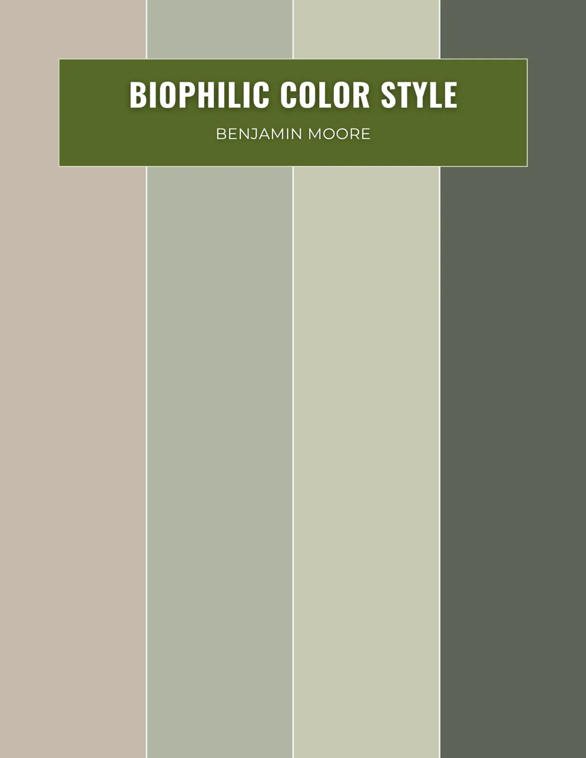
Biophilic Color Style
A grounded palette of earthy greens, mineral neutrals, and botanical undertones designed to reconnect interiors with natural systems and support emotional balance and well-being.
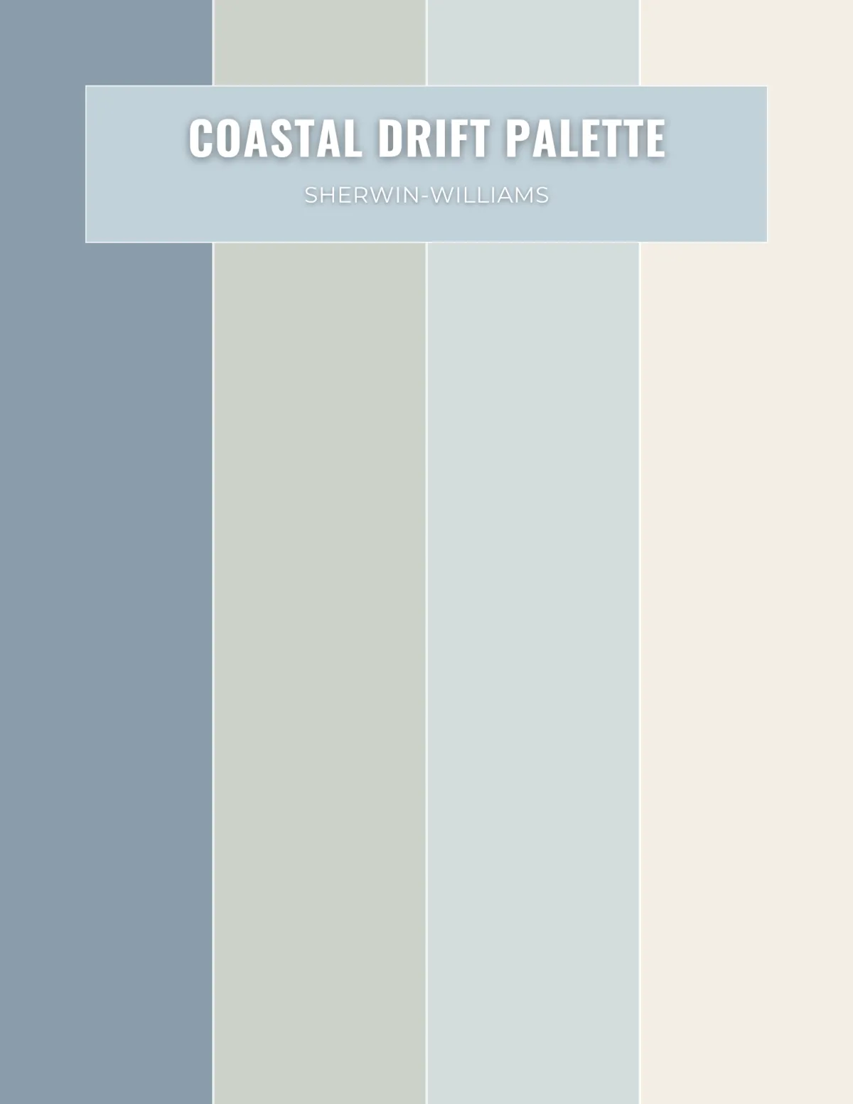
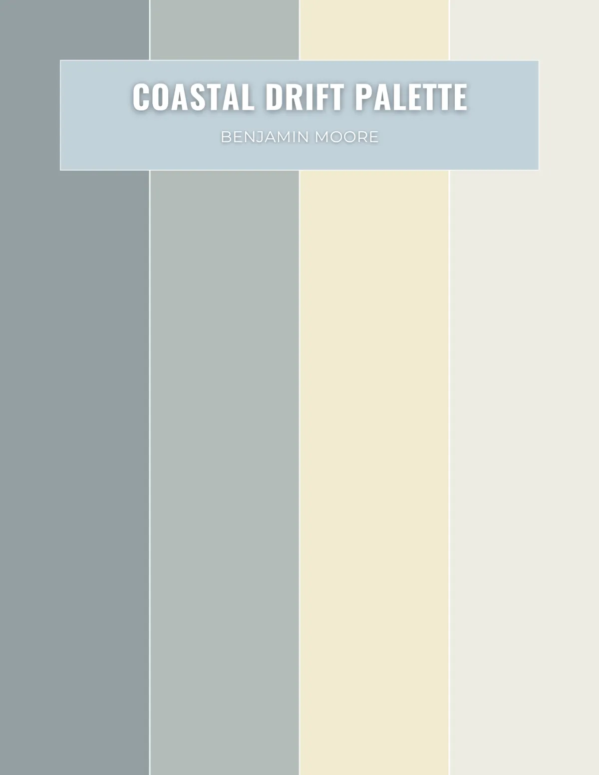
Coastal Drift / Oceanic Palette
A softer, more architectural interpretation
of coastal color that draws from water, sky,
and shoreline references rather than themed decoration.
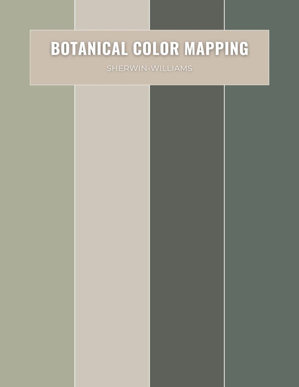
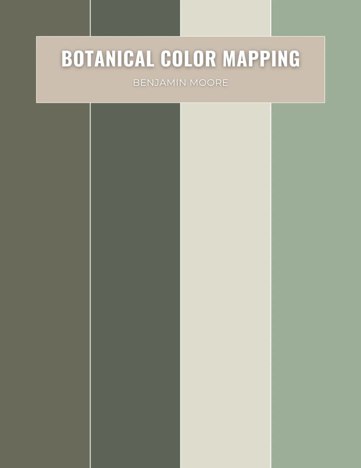
Botanical Color Mapping
A deeper, moodier palette direction that relies on richness, layered lighting, and undertone cohesion to create interiors that feel enveloping, intimate, and quietly luxurious.
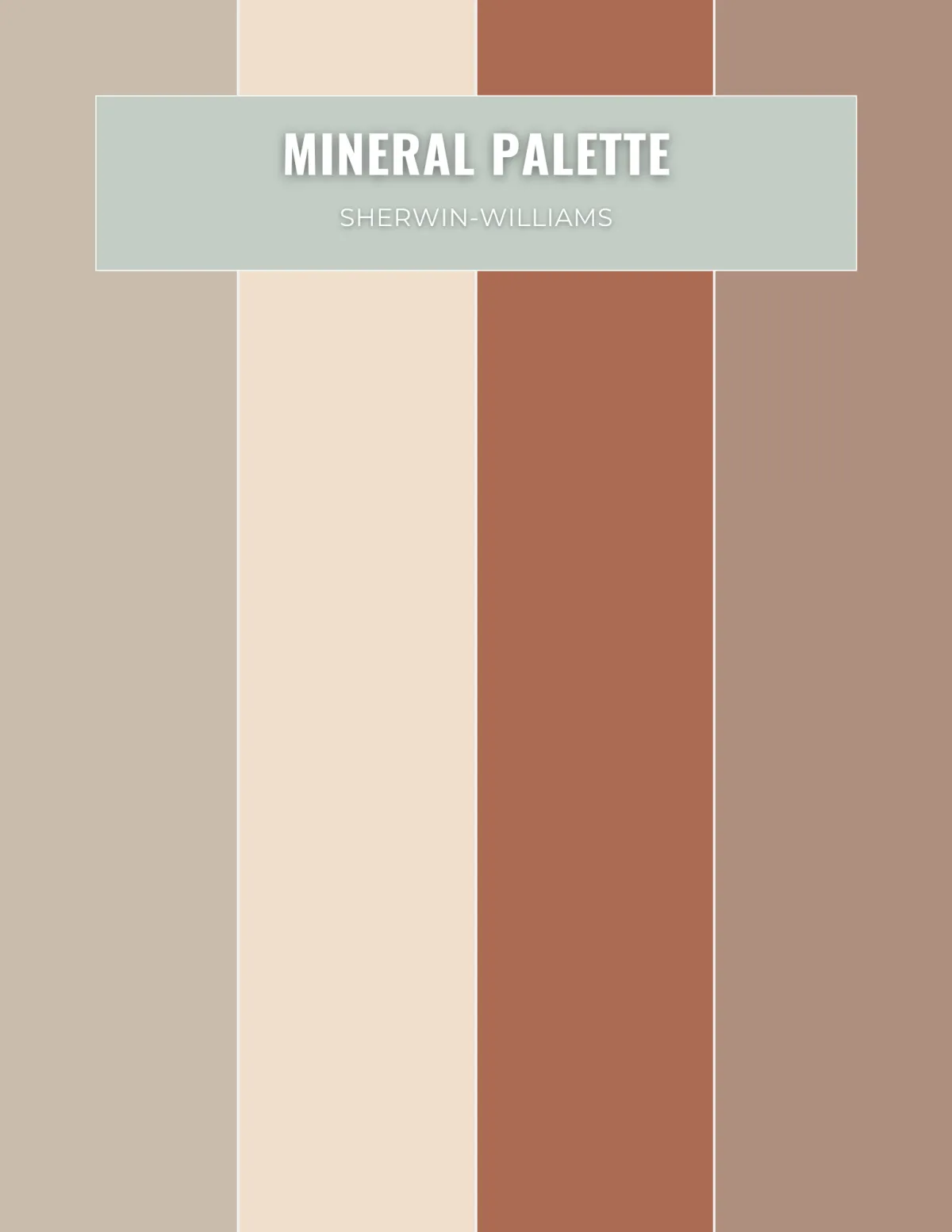
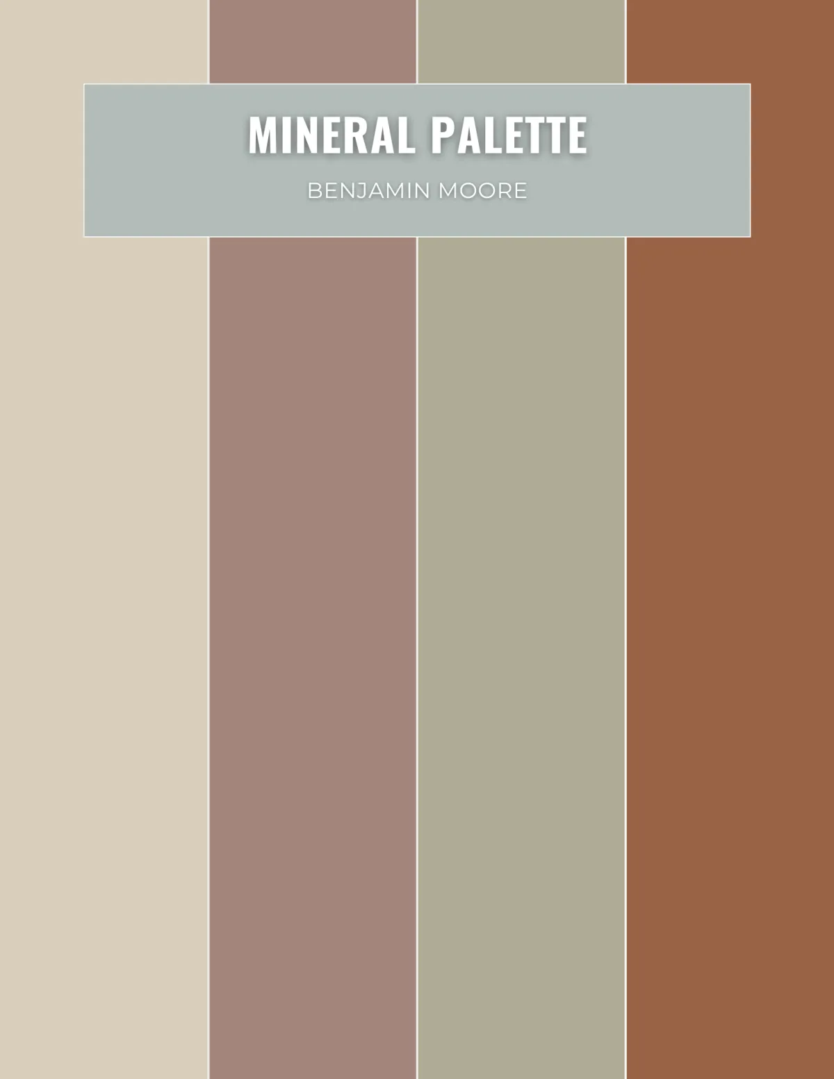
Earth & Clay / Mineral Palette
A restrained warmth story rooted in sun-softened, mineral-based colors that feel timeless and grounded when used with texture, tonal variation, and discipline.
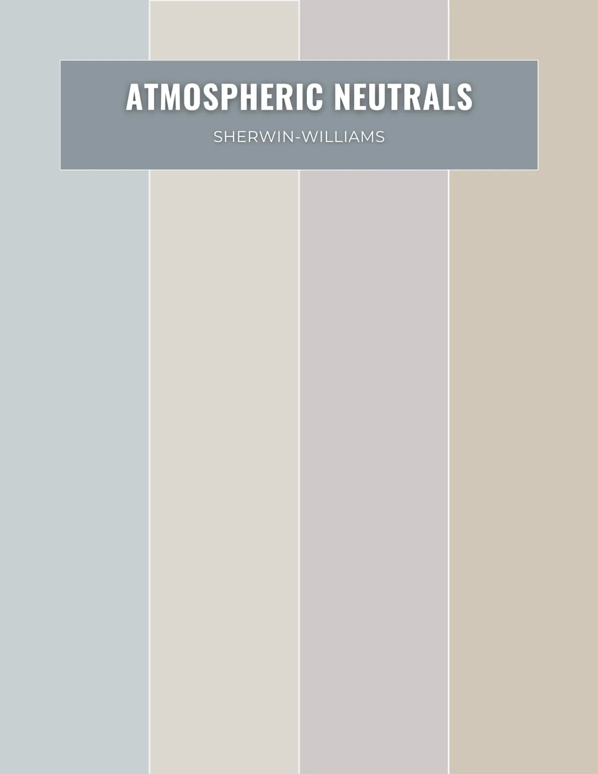
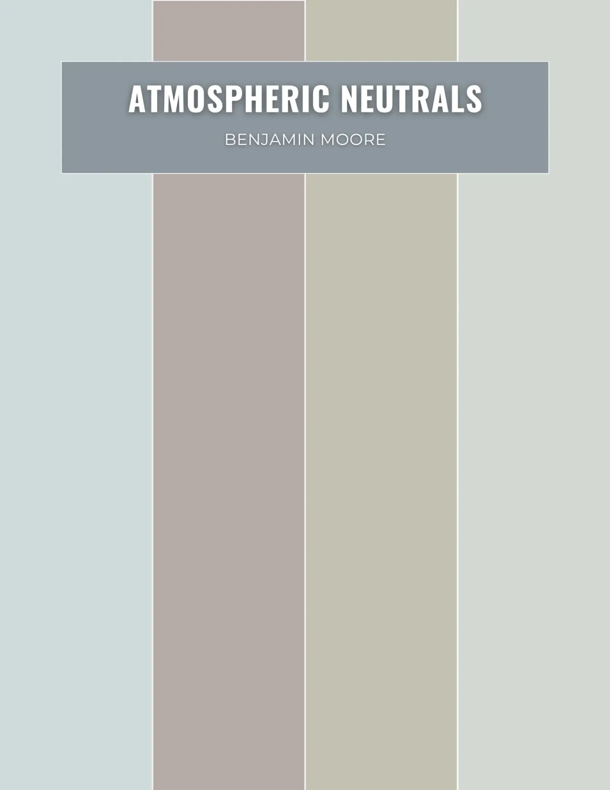
Atmospheric Neutrals
A subtle palette of mist, stone, and softened cool-warm balance that creates serenity, quiet luxury, and visual clarity when supported by natural materials and gentle lighting.
Design with Confidence, Use Color
with Intention.
Whether you are seeking the enveloping security of a deep forest or the breezy clarity of the coast, this guide provides the professional framework to execute your vision flawlessly.
Download your copy of Nature Inspired Color Styles today.
One-time purchase | Instant Digital Access | Professional Results
This Is Not a Color Guide
It is a professional framework for creating interiors that feel grounded, calm, and deeply resolved by aligning color with light, landscape, materials, and human response.
Inside, you’ll learn how to:
· Avoid costly repainting decisions by
understanding how light, proportion, and
undertone relationships affect real spaces
· Replace guesswork with structure, so your
color choices feel intentional, not
uncertain
· Use bold color with control, creating spaces
that feel refined, immersive, and
fully resolved—not overwhelming
· Move beyond surface-level decorating and
design environments that influence
how a space actually feels and functions
Inside, you’ll learn how to:
· The foundations of architectural color
· The science and emotion behind natural hues
· How nature-derived palettes affect mood, scale, and perception
· Five complete nature-inspired color styles
· Best conditions and common pitfalls for each palette direction
· A final reflection on designing in alignment with nature
Who This Is For
· Interior designers and color consultants
ready to use color at a more advanced,
architectural level
· Home stagers who want to create stronger
emotional impact and differentiation in
listings
· Homeowners who are ready to move
beyond safe neutrals and design with clarity
and intention
This guide is ideal for homeowners and designers who want interiors to feel calmer, more grounded, and more architecturally resolved. It is especially useful for anyone who wants to move beyond stark whites, overly cool grays, or trend-based color choices and create spaces that feel balanced, restorative, and enduring.
Coming Soon: The Professional’s Guide to Artistic and Decorative Color Techniques
Mastered our specific style guides? Prepare to master the entire system. Our next professional volume is currently in development, focusing on the sophisticated laws of color harmony and their technical application within high-end interior architecture.
What’s Next
We are diving deep into the "Grand Strategy" of color. This upcoming release provides the professional framework for creating seamless transitions between rooms, balancing complex color wheels, and ensuring that every element—from walls to textiles—exists in perfect, intentional harmony.

©2025 Max Ruthven LLC Color and Design, All rights reserved.