Stop Treating Decorative Color as Decoration
Learn how decorative finishes influence proportion, movement, light, and material perception—so every design
decision strengthens the architecture instead of competing with it.
Stop Treating Decorative Color as Decoration
Learn how decorative finishes influence proportion, movement, light, and material perception—so every design
decision strengthens the architecture instead of competing with it.
The Problem
Decorative finishes are often chosen because they look beautiful in a photograph. But once they are installed, many spaces begin to feel visually busy, disconnected, or strangely uncomfortable. Not because the finish itself was wrong.
Because it was used without understanding
how color, texture, light, and architecture interact. This guide
teaches you how to evaluate decorative color decisions before they become expensive mistakes.
You'll learn how to:
✔ Determine whether a decorative technique belongs in a space at all
✔ Understand what a finish does to perceived volume, depth, and visual weight
✔ Evaluate how light changes the appearance of decorative surfaces
✔ Use texture and movement without overwhelming the architecture
✔ Create focal points that feel intentional instead of distracting
✔ Know when restraint creates a stronger result than adding more detail
Most Decorative Color Advice Focuses on Application.
This Guide Focuses on Evaluation.
You won't learn how to apply limewash.
You won't learn how to stencil a wall.
You won't learn decorative painting techniques.
Instead, you'll learn how to determine:
Whether a technique belongs in a space
What it will do to the architecture
How it affects proportion and perception
When it improves a room—and when it becomes visual clutter
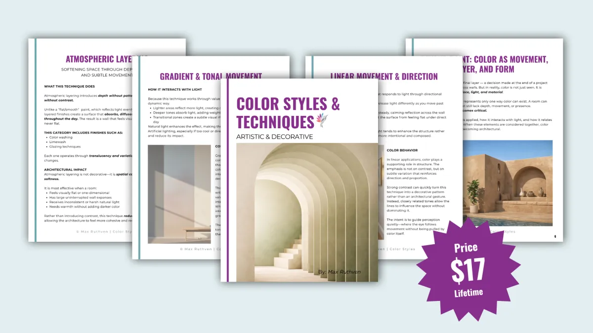
The Techniques Covered
Each section focuses on a different way color can shape a space. Its architectural impact, color behavior, and ideal application
Atmospheric Layering
Creates softness, depth, and visual complexity without increasing visual weight.
Material Transformation
Changes how a surface is interpreted, shifting perception
beyond paint.
Gradient & Tonal Movement
Directs the eye and influences how volume and transition are perceived.
Pattern & Repetition
Creates order through structured visual rhythm.
Linear Movement & Direction
Introduces rhythm, alignment, and proportion.
Natural Surface Enhancement
Strengthens the character of existing materials without overpowering them.
Each technique is explored through its architectural impact, color behavior, and ideal application — not just how it looks.
The Techniques Covered
Each section focuses on a different way color can shape a space. Its architectural impact, color behavior, and ideal application
Atmospheric Layering
Build depth and softness through controlled variation and light diffusion
Gradient & Tonal Movement
Guide perception through subtle, directional transitions
Linear Movement & Direction
Introduce proportion and structure through rhythm and alignment
Material Transformation
Shift perception from painted surface to material
presence
Pattern & Repetition
Establish order and visual rhythm through controlled repetition
Natural Surface Enhancement
Refine and elevate the character of existing materials
Each technique is explored through its architectural impact, color behavior, and ideal application — not just how it looks.
Who This Is For
This guide is designed for:
Designers and color consultants who want to elevate beyond surface-level decisions
Homeowners ready to move past flat, uniform color
Professionals who want to understand color as a system — not decoration
This is not for:
DIY experimentation without context
Trend-driven styling
Quick visual fixes
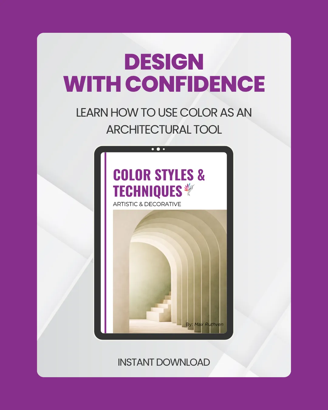
Stop Guessing. Start Evaluating Color Like a Designer.
Whether you're considering limewash, Venetian plaster, tonal movement, pattern, or decorative finishes, this guide helps you understand what those choices actually do to a space before you commit.
Download your copy today and learn how decorative color can support architecture rather than compete with it.
One-time purchase | Instant Digital Access | Professional Results
Developed by Architectural Color Consultant Max Ruthven
After evaluating hundreds of homes, one pattern became clear:
Most color problems are not caused by the wrong color.
They are caused by misunderstanding how color behaves within architecture.
This guide distills the same principles used in professional color consultations into a framework that
helps you evaluate decorativecolor decisions with greater confidence.
When These Techniques Work (And When They Don’t)
These techniques are powerful — but not universal.
They work best in:
Feature walls or defined zones
Spaces with clear architectural structure
Interiors where materials and finishes matter
Projects where longevity and maintenance are considered
They are not meant to be applied everywhere — and they are not necessarily universally neutral or calming.
The Core Idea
Walls are not just boundaries, They are active surfaces that shape how a space is experienced.
When color is treated as architecture, it can:
Correct imbalance
Refine proportion
Create atmosphere
Anchor or soften a space
The goal is not to do more - but to do the right thing, in the right place, for the right reason.
Coming Soon: The Spatial Color System
Mastered our specific style guides? Prepare to master the entire system. Our next professional volume is currently in development, focusing on the architectural relationship between color, light, and physical space to create high-end, immersive environments.
What’s Next
We are diving deep into the "Structural Strategy" of color. This upcoming release provides the professional framework for using color as a spatial tool—allowing you to manipulate room proportions, direct visual movement, and ensure that your palette works in perfect alignment with the architecture of your home.

©2026 Max Ruthven LLC Color and Design, All rights reserved.